The Solution: Simplify the onboarding process Result: Increased signups Website Design Adobe XD
The challenge: Cumbersome UI was frustrating potential customers.
The ShipRush team had a problem. Their product was terrific, but very few people were completing the sign-up process. Their interface was much too detailed, too many fields and choices were required during the signup process, and data showed that many people were just giving up halfway through.
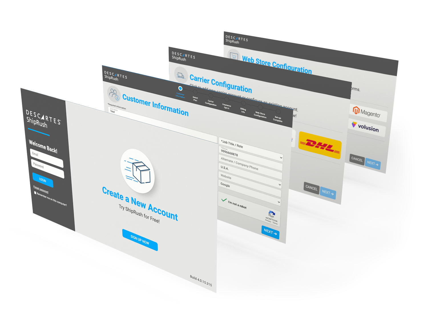
Our team started the redesign with the goal of onboarding customers in just a few steps. We made it easy for people to input their information one time and have any identical fields carry over throughout the signup process. Customers could choose from the top 4 carriers, or choose one from a pulldown list. A similar process was adopted for webstores.
This all-new easy-to-use interface led to a 30% increase in customer signups.
UI Design
UX Design
Photography
Copywriting
Wireframing
Prototyping
Adobe Illustrator
Adobe Photoshop